User Tools
Sidebar
Navigation
software:gui-designer:buttons
Table of Contents
Button Tool
Buttons in guiDesigner can be placed on any page or subpage.
To implement a button in guiDesigner:
- Select the button icon
 on the tool bar.
 - Then draw a box roughly the size of the button you wish to use. This size can be edited later on.
- You will then need to add a theme to the button. To do this, select a button theme from the Theme Library and drag it onto the button you just added.
You can also drag a button theme directly from the Theme Manager or Theme Library onto an empty spot on an open page, and the button will be automatically created at the drop point and assigned the theme you dragged.
Button Properties
To access the button properties, right click on the button and choose Button Properties.
Button Properties Design Tab
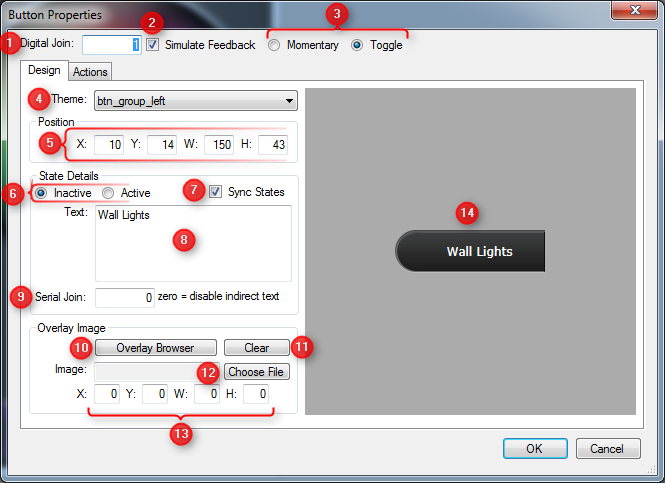
1 - Digital Join
Enter a join number to assign to the button. The digital join controls the state of the button. When the join is low (0) the button will render it's inactive state. When the join is high (1) it will render it's active state.
By default the button will be assigned a digital join of zero, which basically means it cannot change state other than via momentary simulation.
For more information on joins, see the Joins wiki entry.
2 - Simulate Feedback
When a button is set to simulation mode, it will change state when pressed. If simulation is not enabled on the button, the button will only change state when it's assigned digital join changes state. If the button is assigned a digital join, the join state will also change when the button state changes, resulting in other GUI objects using the same digital join to be affected also.
3 - Momentary/Toggle
When Simulate Feedback is enabled, these two options will be available. Momentary means the button will remain in active state as long as the button is being pressed, then return to inactive state when released. Toggle means the button will change to active state when pressed the first time, then back to inactive state when pressed a second time (and so on), toggling between active and inactive state each time the button is pressed.
Toggle mode is only available when the button is assigned a digital join above zero.
4 - Theme
Select the button theme you would like to use. This choice is derived from the button themes you have defined in your project within the Theme Manager.
5 - Position
This option allows for manual entry of the position and size of the button.
- X Position (left of button)
- Y Position (top of button)
- Width of the button
- Height of the button
6 - State Details - Inactive/Active
Choose whichever option you want to preview and edit. Inactive will allow you to preview and edit the button in its non-pressed state. Active will allow you to preview and edit the button in its pressed state.
7 - State Details - Sync States
When the Sync States box is checked, any edits made in Inactive or Active, will also effect the other.
E.g. If you are editing the inactive button, and Sync States is checked, then any changes made will also apply to the active state.
If you want to edit the states separately, then ensure this is unchecked.
8 - State Details - Text
Enter the text here that you want to display on the button.
9 - State Details - Serial Join
This serial join allows you to dynamically change the text value shown on each button state. By assigning a serial join above zero, when that serial join text value changes, any button assigned the same serial join will be updated to show the new text value.
10 - Overlay Image - Overlay Browser
Opens the overlay browser window which allows you to select an image from a library to overlay on the button.
The contents of the overlay library are taken from the guiDesigner installation location, within an overlays folder. You can add your own overlay images to the library by placing them within this folder.
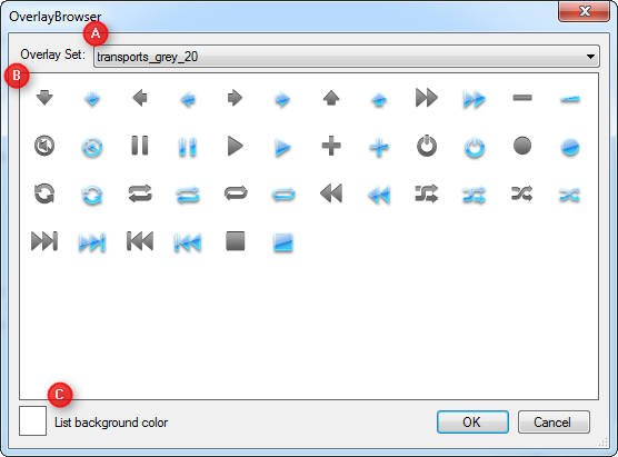
A - Overlay Set
Select the overlay set to choose from.
B - Overlay List
Select the image to overlay on the button.
C - List Background Color
This option allows you to change the background color on the overlay list to allow you to see what that image looks like on a certain color.
11 - Overlay Image - Clear
Removes the overlay image from the button.
12 - Overlay Image - Choose File
Choose a custom image file to use as an overlay image.
13 - Overlay Image - Position and Size
This option allows for manual entry of the position and size of the overlay image.
- X Position (left of the image, relative to the button left edge)
- Y Position (top of the image, relative to the button top edge)
- Width of the overlay image
- Height of the overlay image
14 - Button Preview
A preview of what the button will look like.
Button Properties Actions Tab
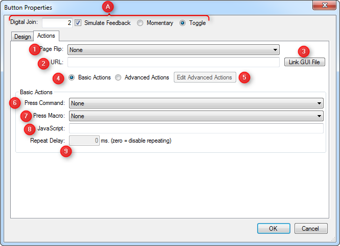
A - Common Settings
For information on these settings, see the Button Properties Design Tab info above.
1 - Page Flip
Select a page to navigate to in your GUI when the button is pressed. Page flips will only work if your device is licensed to run the GUI.
2 - URL
Set the URL property of a button to launch a web browser on the device to a specific website. On iOS devices, you can also launch other apps by using their URL Schema as the URL.
You can also force iViewer to load another GUI by entering the URL of the GUI file to load, replacing http:// with cf://.
3 - Link GUI File
When clicked, this will bring up documentation on how to use GUI File linking.
4 - Basic Actions/Advanced Actions
There are two ways to assign commands and macros to buttons:
- Basic Actions - Allow a command and/or macro, as well as a repeat time
- Advanced Actions - Allow multiple groups of commands and macros with more control over how they are triggered
Basic Actions
With basic actions, you can assign any Command and/or Macro to a button. This covers most needs for users. There is also a repeat delay option which controls how often the command and/or macro is sent whilst the button is held down.
Advanced Actions
With advanced actions, you get a lot more control over when actions are fired. They are more complicated to setup, but quite simple once you understand how they work. See the Advanced Button Actions topic for more details.
5 - Edit Advanced Actions
6 - Press Command
Choose a command that you have previously defined in the System Manager to assign to the button.
7 - Press Macro
Choose a macro that you have previously defined in the System Manager to assign to the button.
8 - JavaScript
Enter a line of JavaScript code to execute when the button is pressed. The repeat delay will also cause this code to be executed repeatedly whilst held.
JavaScript as a language allows you to enter even long functions as a single line of text.
For mor information on JavaScript support in iViewer, see the JavaScript API Documentation.
9 - Repeat Delay
Enter the time in milliseconds that you want iViewer to wait until repeating the command if the button is held down. Enter 0 to disable repeating. For example, 1000 means “repeat every second”.
software/gui-designer/buttons.txt · Last modified: 2013/04/04 04:09 by aaron