User Tools
Sidebar
Navigation
software:gui-designer:sliders
This is an old revision of the document!
Table of Contents
Sliders
Sliders are much like Gauges, except they also allow for interaction by the user (rather than just showing a level).
To implement a slider in guiDesigner:
- Select the slider icon
 on the tool bar.
 - Then draw a box roughly the size of the slider you wish to use. This size can be edited later on.
- You will then need to add a theme to the slider. To do this, select a slider theme from the Theme Library and drag it onto the slider you just added.
Whats the difference between a gauge and a slider?
Good question! A gauge takes a reading from a device/system, and displays the level as a visualisation. A slider is a control that the user can manipulate to change the level of the device/system.
Slider Properties
To access the slider properties, right click on the slider and choose Slider Properties.
Slider Properties Design Tab
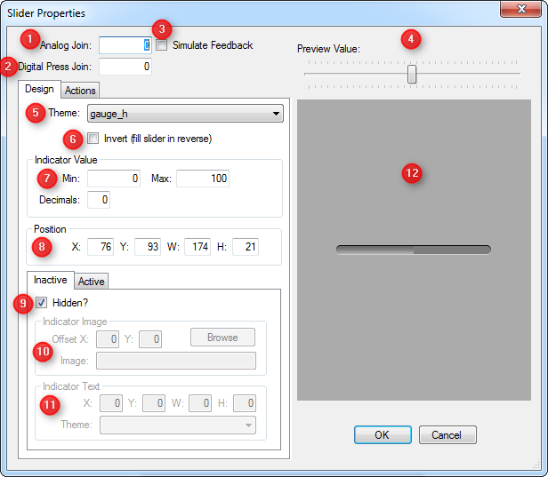
1 - Analog Join
The analog join assigned to a slider is used to adjust the slider level. Analog joins have a range of 0 to 65535, which is represented in a slider as 0 = slider empty, 65535 = slider full.
If the slider is assigned an analog join above zero, the join value will also change when the slider level is changed, resulting in other GUI objects using the same analog join to reflect the new level also.
By default the slider will be assigned an analog join of zero. Before the slider can show any feedback in the form of the slider level, it must be assigned an analog join above zero.
2 - Digital Press Join
By assigning a digital join to a slider, you can make it also act like a momentary button. The digital join will go high (1) when the slider is first pressed, then go low (0) again when released.
If the slider is assigned a digital join above zero, the join state will also change when the slider is pressed/released, resulting in other GUI objects using the same digital join to reflect the new state also.
By default the slider will be assigned a digital join of zero.
3 - Simulate Feedback
When a slider is set to simulation mode, it will change state when manipulated by the user. If simulation is not enabled on the slider, the slider will only change state when it's assigned analog join changes value.
4 - Preview Value
Use this slider to change the slider fill level in the preview window.
5 - Theme
Select the slider theme you would like to use. This choice is derived from the gauge/slider themes you have defined in your project within the Theme Manager.
6 - Invert
Check this box to fill the slider in reverse. E.g. fill the slider from the right to left for horizontal sliders (or from top to bottom in the case of a vertical slider).
7 - Indicator Value
These settings control two things:
- The indicator value that is rendered as text on the slider indicator (if the slider is configured to use indicators).
- The value that is sent within commands attached to the slider, using the
[sliderval]token.
Min: the minimum value of the slider range. Default is0.Max: the maximum value of the slider range. Default is100.Decimals: the number of decimal values to include in the value. Defaults to0which means don't show any decimal values.
8 - Position
This option allows for manual entry of the position and size of the slider.
- X Position (left of slider)
- Y Position (top of slider)
- Width of the slider
- Height of the slider
The width and height of a gauge determines if the gauge is rendered in horizontal or vertical mode. When the height is greater than the width, the gauge will render in vertical mode (filling bottom to top). Otherwise, it will be deemed a horizontal gauge (filling left to right).
9 - Inactive/Active Tab - Hidden?
Points 9 - 11 cover both the Inactive and Active tabs as they have the same configurable properties. Choose which tab you want to edit. Inactive will allow you to edit the slider in its non-pressed state. Active will allow you to edit the button in its pressed state.
10 - Inactive/Active Tab - Indicator Image
11 - Inactive/Active Tab - Indicator Text
12 - Preview Window
This windows shows how the slider will look in your GUI, showing the value as set in the Preview Value.
Slider Properties Actions Tab
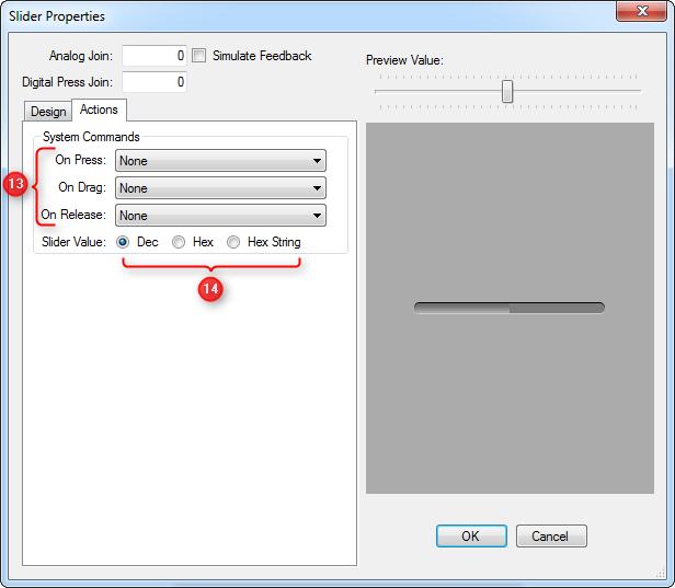
13 - System Commands
Choose a command that you have previously defined in the System Manager to each slider action.
14 - Slider Value
software/gui-designer/sliders.1363916526.txt.gz · Last modified: 2013/03/22 01:42 by jarrod